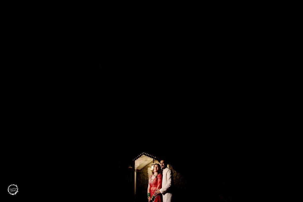
Start With the Feeling, Not the File Count
Most couples approach the album with a spreadsheet mindset. They sort by timeline, by outfit change, by family group. That is a useful way to organize, but it is not how you should choose. The album is not a record of what happened. It is the version of your wedding you want to relive for the next fifty years.
So before you open the gallery, close your eyes and name the moments that still make your chest tighten. The way your grandmother cried during the vows. The burst of laughter when the ring bearer tripped. The quiet minute you stole with your spouse behind the mandap. Write those down. That list is your compass.
Build in Layers, Not a Linear Story
A wedding day has texture. It moves from anticipation to adrenaline to exhaustion to joy. Your album should mirror that rhythm, not flatten it into a chronological slide show.
Think of it in three layers. The first layer is the essentials: the getting-ready shots, the ceremony, the first dance, the exit. These carry the narrative. The second layer is the connective tissue: the hands being held, the glance across the room, the cousin adjusting the dupatta. These give the album breathing room. The third layer is the texture: the detail shots, the candid laughter, the empty chair with the tossed bouquet.
A common mistake is to include every technically perfect photo and cut the emotionally messy ones. Resist that. A slightly blurry shot of your mother wiping her eye is worth more than a crisp photo of the cake. The album should feel like a memory, not a catalog.
Set Your Non-Negotiables First
Before you start deleting, pick the ten images you could not live without. These are your anchors. Everything else gets chosen around them. If you and your partner disagree, each of you gets five. That prevents the long negotiation that kills the joy of the process.
Once the anchors are set, move through the gallery in passes. First pass, remove anything that is technically flawed: closed eyes, awkward angles, motion blur. Second pass, remove anything that duplicates a moment. You do not need three versions of the same hug. Third pass, ask one question of every remaining photo: does this earn its place in the story? If it does not, cut it.
Balance Faces, Places, and Details
Too many albums are dominated by posed portraits. Those are important, but they are not the whole story. Your wedding had a setting, and that setting shaped the day. The venue, the decor, the light through the window, the way the rain started during the baraat. Those images anchor you in the place.
Details matter in a different way. The embroidery on your lehenga, the rings on the table, the handwritten vows, the mehendi on your hands. These are the images you will look at when you want to remember the texture of the day, not just the people in it.
A good ratio to aim for is roughly forty percent people, thirty percent moments, twenty percent details, ten percent place. That is not a rule, just a starting point. If your wedding had an especially emotional ceremony, let that section run longer. If the decor was your obsession, give it more room. The album should feel like your day, not a template.
Trust the Edit, Then Edit Again
The hardest part is not choosing the first fifty. It is cutting down to the final thirty or forty. Your photographer likely delivered several hundred edited images. You cannot put them all in the album, and you should not try.
Here is a practical trick. Put every photo you are considering into a folder. Then step away for a day. When you come back, go through and remove anything that does not immediately make you feel something. If you hesitate on a photo, that is a sign it is not essential. The album should be built on conviction, not indecision.
Once you have a rough selection, lay it out in a spread view if your photographer offers a design tool. See how the images play against each other. A photo that works on its own can feel repetitive next to a similar one. Move things around. Sometimes cutting one image makes the two beside it stronger.
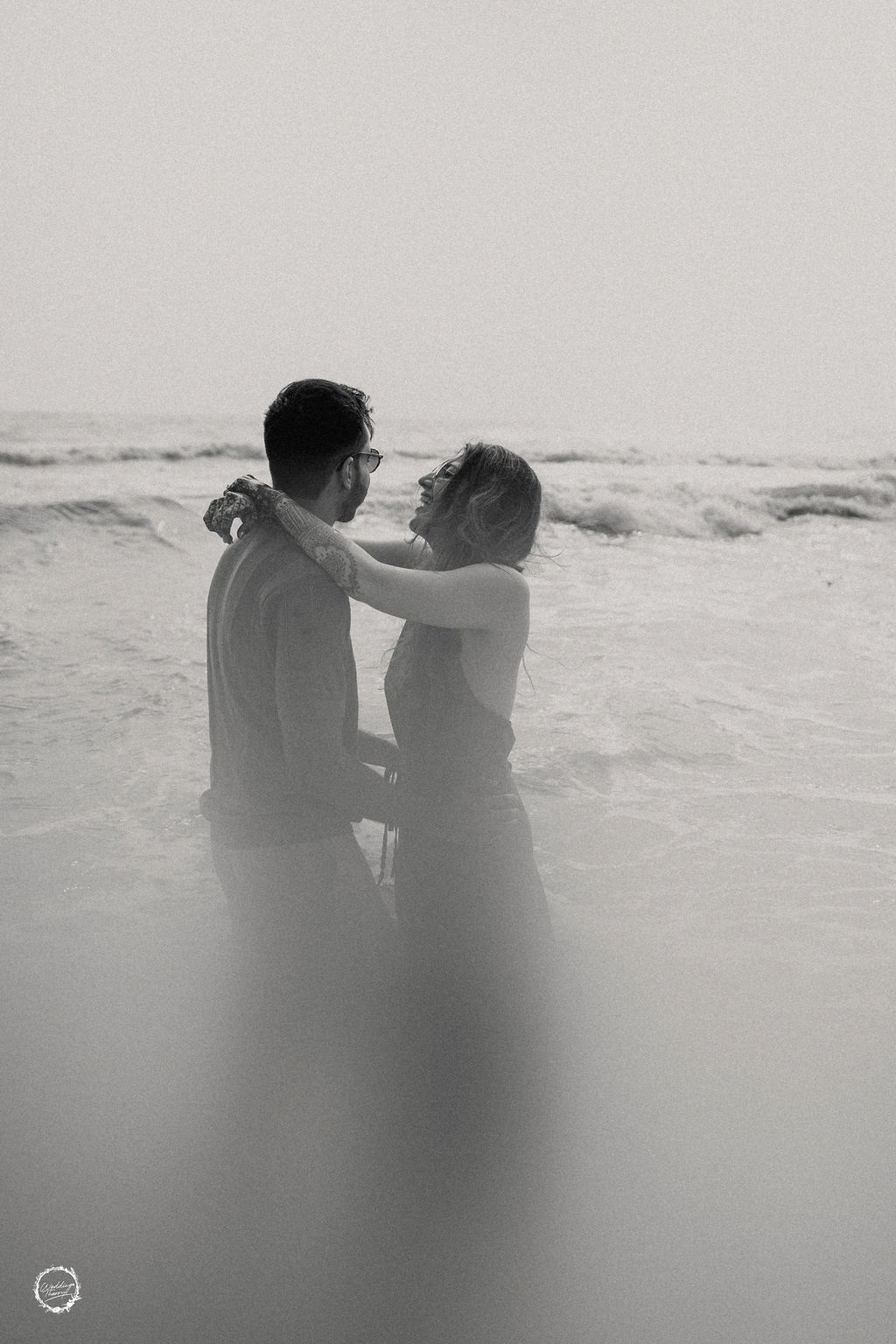
Design for the Turn of the Page
A wedding album is not a wall of photos. It is a sequence. The way one image leads into the next creates meaning. A wide shot of the full ceremony hall followed by a tight shot of your hands during the exchange of garlands tells a mini story. A series of portraits grouped together can feel static. Break them up with candids or details.
Think about the opening and closing images. The first page should set the tone. It might be a quiet shot from the morning, or a detail that hints at the day to come. The final image should leave you with a feeling of completion. Often that is the exit, the sparklers, or a last embrace. Choose those two deliberately.
Also consider the physical book. The cover image is the one you will see every time you reach for the album. Pick something that represents the day at its fullest. A portrait of the two of you, or a moment that captures the joy. The inside pages can be more experimental.
When to Stop Adding
There is no perfect number of pages. Some couples want a lean forty-page book. Others want a hundred. The right length is the one that holds your attention from start to finish without feeling padded. If you find yourself skimming sections when you flip through the proof, you have too many pages.
A useful test is to read the album like a guest who was not there. Does it tell a coherent story? Would they understand the arc of the day? If they would get lost, you might need a few more connective images. If they would get bored, cut harder.
Finally, remember that the album is a collaboration. Your photographer has designed hundreds of these. They know how images flow across a spread, what sizes work, and where white space helps. Send them your shortlist and ask for their recommendation. They will often suggest cuts you were too attached to make, and those cuts almost always improve the final book.
The goal is not to include every good photo. It is to create an object that you will pull off the shelf on anniversaries, that your children will page through, that will make you feel, in one glance, exactly what that day felt like. That takes restraint, not accumulation.